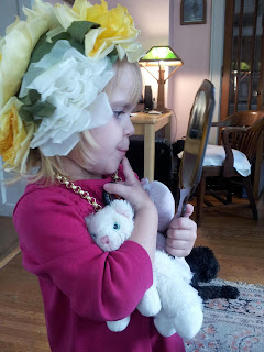
 Drawing or painting a portrait is a lot of work. Even an 8 x 10 takes hours to create. Honestly, I could make more money flipping burgers at MacDonalds, but I doubt that any burger I served up would ever bring tears to a patron's eyes. (At least, I hope not.) In short, portraiture is imminently satisfying, whereas making burgers would be only mildly so.
Great portraits are special because they have been created from sources which have innate qualities which us able to connect with them on an emotional level. Study Norman Rockwell's art, and you'll see what I mean. He was an incredible artist, but he was an illustrator who knew that his paintings had to do more than just look like whatever he was painting. They communicated some emotion, quality, or story which connected with the viewer on a deeper level.
Many of the images I encounter don't quite make the Norman Rockwell cut, but I always encourage my clients to search for the one that comes as close to it as possible, because it's worth it in the end. It's not unlike Mark Twain's lightning vs. the lightning bug in choosing the right word when writing.
What knocks a photo out of the running as a good choice for becoming a portrait?
I occasionally come across a posed picture that is acceptable. It might not be a tremendous wow in my book, but I wouldn't consider it a waste of time to draw, either. Norman Rockwell did pose models for his paintings (heaven knows how), but I'm sure it was a ton of work and wasn't one of your general "say cheese" affairs. Since I'm usually working with retrospective photo options, I'm often confronted with cheese-photos, but I try to steer clients toward better choices.
2. Blurry
My imagination simply isn't up to the task of filling in large photographic gaps. While you as a client might know the subject in question intimately, I do not. A slightly blurry main photo with accompanying sharp reference photos is sometimes all right. It depends, and I don't mind using a slightly off photo if it's good in other respects, but a very blurry main photo just won't work.
3. Doesn't contain enough pixels as a digital shot
Since my phone is just a phone with which I talk rather than take photos, it's only a guess that cell phones produce much of the low quality photography out there. Some of the phones might produce good images, but I've run into more than one low-pixel shot which I can't use. In this age of digital photos, most images I work with are sent to me through email. I blow these up on my laptop so I can see small details. If there aren't enough pixels, I can't do this.
4. Taken by a professional photographer
Don't go into shock here, but photographers are artists, too. They just use a camera instead of a pencil or brush. If you want one of their pictures turned into a portrait, you'll have to have their permission to do it. Personally, I'd prefer not use their photos, because after all, if you want one of those high quality images, you can buy it from the photographer. You don't really need me. Those types of posed photos aren't what I look for as an artist.
Now for the good stuff. We're assuming that you have a non-professional shot which is not obviously posed, not exceptionally blurry, and has plenty of pixels. What else is there?
What you want in a portrait photo
What you want in a portrait photo
1. Natural lighting (no flash)
Generally speaking, I have an extreme dislike for photos taken with a flash. They flatten out the subject like a pancake, creating harsh shadows in the bargain. Bright sunlight can do the same thing. I can reduce some of the damage in a portrait, but you'll probably still be able to tell it was taken with a flash in the end, since the light source will be right in front of the subject. For best results, take pictures with natural lighting. Overcast days are nice for diffused light, especially if you're dealing with a point and shoot camera.
2. Close up shot that doesn't cut off any part of the head or torso which you want in the portrait
While I have performed reconstructive surgery while drawing, I prefer not to! It's difficult to draw a high quality portrait of what you have no reference material for. For best results, the photo should be complete.
3. Taken on the subject's level
Looking down on a subject is rarely flattering, so you're better off getting down on your subject's level, where ever it is. Don't be afraid to move around while taking a photo. You're mobile. : )
4. The special ingredient: a candid moment
Ah, now we get to the one thing no portrait can do without. This is the innate quality or characteristic that calls to the viewer's heart. You see it in the eyes of the subject, a soul-to-soul communication. There is no hastily constructed façade created by a photographer's request that the subject look into the camera and say, "Cheese!" Instead, the subject's emotion of the moment, unguarded and open before you, has been captured. It might be joyful. It might be sorrowful. It might be pensive. But it has the elusive quality which will make it special. Find it, and you'll have found a photo worthy of a portrait.


No comments:
Post a Comment